Planetary Lines on a World Map: How to Read Yours
October 10, 2026 · 9 min read · The TriMoon Team
 AI-generated. Written by a model and not reviewed by a person.
See where on the world map your chart highlights what matters to you, with a reading for the places you are considering — $25, one-time.
Get your Relocation Report — $25 →
A planetary line map looks like a web of curves until you know four things: what the four kinds of line mean, how a line is named, how far its reach goes, and how much your birth time moves it. This is a plain-language guide to reading yours.
What a planetary line is, in plain words
A planetary line is a line drawn on a world map that marks where, at the moment you were born, a planet stood in a particular spot in the sky for that place: just rising over the horizon, setting, at its highest point overhead, or at its lowest point under your feet. Every planet in your birth chart gets four such lines, so a full map is a web of lines running across the continents and oceans. The technique of drawing them was popularized in the 1970s, and it is the picture behind what this guide calls relocation astrology: reading how the same birth chart is emphasized differently depending on where on Earth you stand. The pillar guide to relocation astrology covers the idea itself. This post is the practical companion: how to look at a map of your own lines and make sense of it.
First, the lines depend on the moment you were born, not on the town you were born in. Your birthplace is only used to find what the clock said at that place and date, so the time can be converted to a universal moment. Two people born in the same minute in different countries have the same lines. Second, a line is a way of saying "this planet's theme is emphasized around here." It is not a verdict on a place, and it is not a reason to move or to stay away. The product's own wording is the right frame: it describes emphasis, not a reason to move.
The map you will see on TriMoon is calculated, not guessed. The positions come from a high-precision ephemeris — a table of where each planet was at any moment — and the lines are drawn from them. You can draw yours with the free relocation map: enter your birth date, exact time and town, and it draws every line of your chart on a world map, with no sign-up. The written readings in the paid Relocation Report are composed by an AI system from that computed chart, while the lines, distances and place lists are calculated, not AI-generated.
The four kinds of line: Public life, Home, Self and Partners
Each planet has four lines, and each line belongs to one of four angles. An angle is simply one of four special points of the sky at your birth moment. On the TriMoon map the angles are named by what they stand for, so you never need to memorize an abbreviation:
- Public life (the Midheaven, or MC): the planet at its highest point overhead. Practitioners associate it with reputation, visibility and career.
- Home (the Imum Coeli, or IC): the planet at its lowest point, under your feet. It is associated with home, roots and privacy.
- Self (the Ascendant, or ASC, also called the rising line): the planet just rising over the eastern horizon. It is associated with presence and first impressions.
- Partners (the Descendant, or DSC): the planet setting over the western horizon. It is associated with partners, other people and agreements.
If you have read about the rising sign, the Self line is the same idea stretched over the globe: the rising point at your birth, but shown everywhere at once instead of at only one place.
On the map the four kinds also look different, so color is never the only clue. Self and Public life lines are drawn solid, while Home and Partners lines are dashed. That makes a crowded map easier to scan: a quick glance tells you whether the line threading through a region is one of the "outward" pair or one of the "inward" pair.
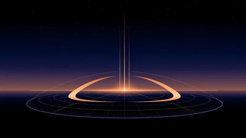
You may notice the lines do not all have the same shape. The Public life and Home lines run straight north to south, from pole to pole. The Self and Partners lines curve. The reason is geometry. A planet reaches its highest point over a whole north–south line of places at once: everywhere on the same line of longitude sees it culminate at the same moment, so that line is straight. Its lowest point is the same line on the far side of the world, half the globe away. But whether a planet is on the horizon depends on where the horizon is, and the horizon tilts with latitude. The set of places where the planet is just rising at one instant therefore bends and sweeps rather than running straight. The rising and setting lines of one planet are mirror partners, and at the equator they sit about a quarter of the way around the globe on either side of the planet's Public life line.
How a line is named: the planet keyword plus the angle
On the map and in the report, a line is named with two plain words joined by a dot: a planet keyword first, then the angle. A line called Identity · Public life is the Sun's line for the Midheaven. Affection · Home is Venus on the Imum Coeli. You can read the name left to right: "the theme of identity, around public life."
The planet keywords are a fixed vocabulary, the same for every map. The first ten are the Sun, the Moon and the planets from Mercury to Pluto:
- Identity (Sun): identity, vitality, purpose
- Feelings (Moon): feelings, needs, comfort
- Thinking (Mercury): thinking, learning, communication
- Affection (Venus): affection, harmony, connection
- Drive (Mars): drive, courage, initiative
- Growth (Jupiter): growth, optimism, generosity
- Structure (Saturn): structure, patience, responsibility
- Change (Uranus): change, originality, independence
- Imagination (Neptune): imagination, ideals, intuition
- Transformation (Pluto): transformation, depth, resilience
The map draws two more points besides these ten, for twelve in all: Direction (the Moon's North Node: direction, learning, belonging) and Sensitivity (Chiron: sensitivity, insight, mentoring). Twelve bodies with four lines each is 48 lines, which is why a complete map looks busy.
Two reading habits help. First, treat every keyword as a theme, not a mood forecast. Structure is not a warning label; it is the theme of order, patience and responsibility. Drive is not "conflict"; it is initiative. Second, remember that the planet keyword says what and the angle says where in life it shows up. "Feelings · Home" and "Feelings · Public life" share a planet but point at very different parts of a life.
If you are new to the planets themselves, planets in the birth chart is a gentler place to start before you read your own map.
Distance: a line is a band that fades, not a thin stroke
On a world map a line looks like a thread, but the TriMoon map treats it as a band that fades with distance. The influence is described as strongest on the line and weaker the farther you are from it. The product uses three distance steps, measured in kilometers from the nearest point of the line:
- On the line: within 300 km.
- Near: from 300 to 600 km.
- In the background: from 600 to 800 km.
Beyond 800 km a line is ignored. Those are the same words you see in the table beneath the map, in a column called "Distance band."
This is also the answer to a common worry: you do not have to live on a line. Because each band is wide, a place within a few hundred kilometers of a line is in its zone, and a place with no line within 800 km simply has none of the twelve bodies emphasized by angle. The useful question is rarely "is there a line here?" but "which lines are closest, and how close?"
A line at 40 km and a line at 500 km are not equally prominent, so read the closest ones first and the faint ones last. The paid report lists every line within 800 km of each place you name, with the distance in kilometers, so no fact on the map lives only on the map.
Where lines meet: crossings
Because there are 48 lines, many of them overlap in some part of the world. Practitioners often read such a spot as a blend of the two themes at once. A place where a Growth line and an Affection line run close together is described as having both of those themes in the foreground, rather than one alone.
The Relocation Report has its own word for this: a crossing. In the report, a crossing is a latitude where two lines meet, counted when they come within 1 degree of latitude of each other. The traditional word for it is "paran," a term from older astrology, but the report keeps to "crossing" and lists the crossings near each place alongside the lines. The free map does not draw crossings as a separate layer, so on the free map you spot an overlap by eye, where two lines run through the same area.
One caution: a crossing adds a second theme to the picture; it does not add a verdict.
Why your birth time moves every line
Every line on the map moves sideways, east or west, with your birth time. The Earth turns about 1 degree every 4 minutes, so a birth time that is 4 minutes off shifts all lines by about 1 degree of longitude. On the ground that is roughly 110 km at the equator and closer to 70 km at 50 degrees north, about the latitude of Kraków or Vancouver. An hour of error moves every line by around 15 degrees, which is far more than the reach of any single line. A common cause of an hour's error is a missed summer-time (daylight saving) change in the birth record.
That is why the free map and the report both ask for an exact birth time and do not draw a map without one. If you are unsure of your time, why your exact birth time matters explains how to find it and what each source is worth.
The map helps you see the uncertainty rather than hide it. The free map has a Birth-time margin selector. You tell it how your time was recorded: a birth certificate or hospital record, remembered by a family member, or a best guess. It then shades a band around each line to show where the line could sit given that margin. A wide shading means you should treat each line as a broad zone. The paid form works the same way: it tells you that, at your birth latitude, every line could sit up to a stated number of kilometers east or west of where it is drawn.
A practical rule follows. If a place sits close to the edge of a distance band, or a line passes close to a place only inside the shaded margin, do not lean on the exact kilometer figure. Lean on the broad picture: which themes recur across the map for the region you are looking at.
Reading the interactive map: what each control does
Here is what you will actually see on the map, and how to use it without getting lost.
- Lines shown. Two rows of toggle chips let you show or hide each planet and each angle. Start with all lines visible, then switch off everything except one angle, say Self, to see only the rising lines. Each chip carries the plain keyword; hover it for the fuller keyword list.
- Region buttons. Jump from the whole world to Europe, North America, Latin America, Asia-Pacific, or the Middle East and Africa. A region view is far easier to read than the whole globe at once.
- The hover label. Move over any line and its name appears under the map in the form you now know, such as "Identity · Public life."
- Birth-time band. Toggle the shading described above on or off.
- Check one place. Pick one town and the tool lists the lines that pass within 800 km of it, and how close each one is. The distances are measured on your own screen from the lines above.
- Download PNG. Save the image of your map.
In the paid report, the map is read a little differently. The strongest lines are drawn in color and every other line is a thin grey hairline, so the picture stays legible.
What to do with what you see
A simple order keeps a map of 48 lines useful.
- Start with a place you already know. Check the town where you live now, or one you have spent a long time in. See which lines are close, and compare their keywords with how that place has actually felt. It is the best calibration you have, because you already know the place.
- Look at themes, not scores. Read the closest line first, then the next. Ask which of the four areas of life (Public life, Home, Self, Partners) shows up, and whether the keyword is something you would welcome there.
- Note the distance band. On the line, near, or in the background are three different strengths of emphasis, and a faint line deserves a faint reading.
- Hold the birth time loosely. If your time is not documented, lean on the broad pattern rather than any single kilometer.
- Keep real life in the decision. Work, family, cost, visas and health care decide where people live. A line says nothing about any of them, and the product is explicit that it is not advice about where to live.
When you want to go beyond looking, the Relocation Report reads your lines for the priorities you choose and for up to five places you name, with a table of nearest lines and distances for each. If your question is specifically about moving abroad, relocation astrology and moving abroad covers what the technique can and cannot tell you, and which question each method answers compares planetary lines with a relocated chart and a solar return abroad. If your question is about choosing between places, where you might feel most like yourself walks through comparing them.
A line is a lens for reflection. Use the map to notice themes, ask better questions about a place, and then let the practical facts of your life make the decision. For the bigger picture, return to the guide to relocation astrology, or draw your lines right now with the free relocation map.
This article was written by AI and has not been reviewed by a person. The astronomy behind it is TriMoon's own precise ephemeris data — not generic horoscopes.